Gallery section
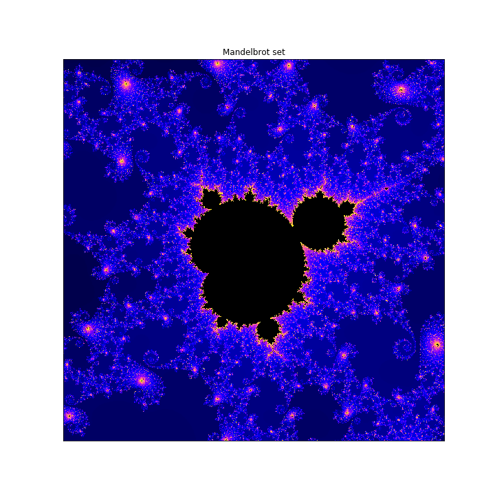
Mandelbrot set
Complex fractal shape shown here in tribute to the mathematician Benoit
Mandelbrot
Definition: The Mandelbrot set M is the set of all parameters c ∈ C for which the Julia set J(f) of f(z) = z^2 + c is connected. Algorithm developed with Python. Uses the following modules: numpy for array operations, pyplot for graphics and numba for jit (just-in-time compiler for speeding up each run). Developed during the Wesleyan course: 'Introduction to Complex Analysis'. Details: the colormap used is "gnuplot2". Number of iterations: 2048. Window size: x ranges from -0.74877 to 0.74872 and y ranges from 0.065053 to 0.065103
Read More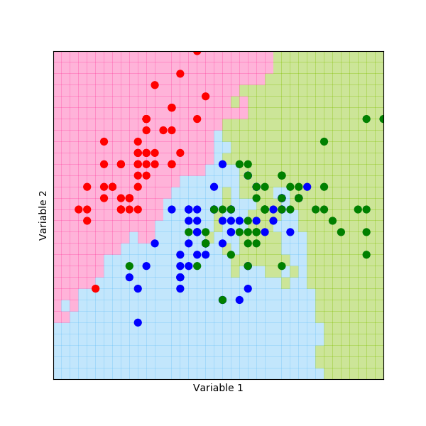
Machine learning:
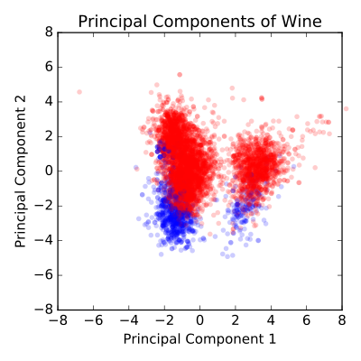
Classification algorithms
Left photo: Iris flower data from the scikit-learn python library for machine learning. This famous (Fisher's or Anderson's) iris data set gives the measurements in centimeters of the variables sepal length and width and petal length and width, respectively, for 50 flowers from each of 3 species of iris. The species are Iris setosa, versicolor, and virginica. Right photo: Wine classification analysis. Code to be added in the near future. Developed during Harvard course: 'Using Python for research'.
Read More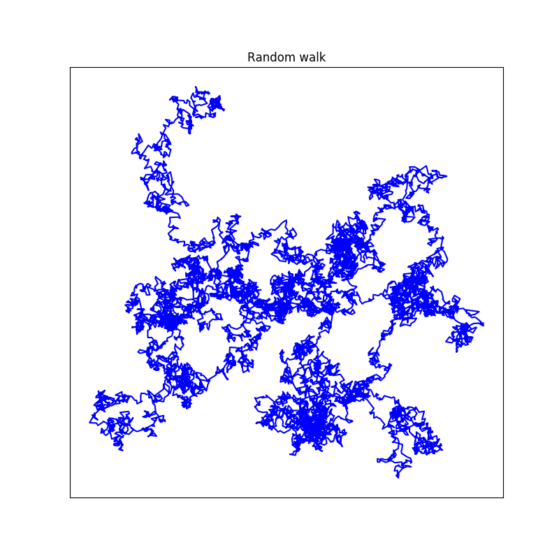
Markov chain:
Random walk
This random walk starts out from the origin (0,0) and continues for a total of 10.000 steps. Each step is randomly chosen from the standard normal distribution with mean equal to zero and standard deviation of unity. Developed during the Harvard course: 'Using Python for research'.
Read More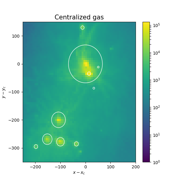
Illustris zoom-simulation
Analysis of merging galaxy clusters
Left: Gas particles around two merging galaxy clusters taken from the Illustris simulation. Galaxies with total star mass larger than 1e7 is included. These galaxies are surrounded by circles of radii given by their half-mass-radii.
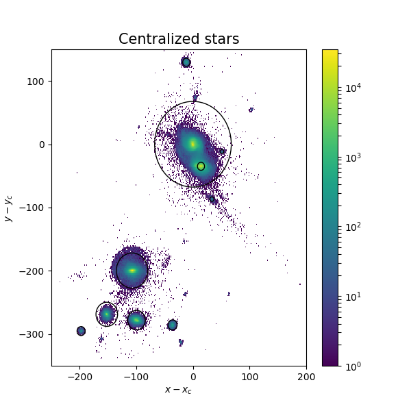
Right: Only galaxies with total star mass larger than 1e7 is included. These galaxies are surrounded by circles of radii given by the half-mass-radii. The stars belonging to these galaxies are shown as well. Data provided by Martin Sparre
Read More
Examples of plotting options with the Seaborn package for Python.
UCPH Masters course: NBIK14032U Linux and Python Programming
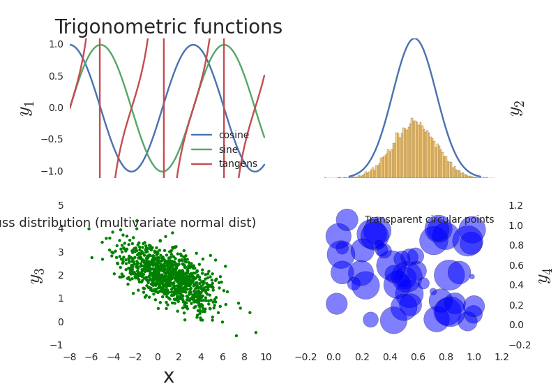
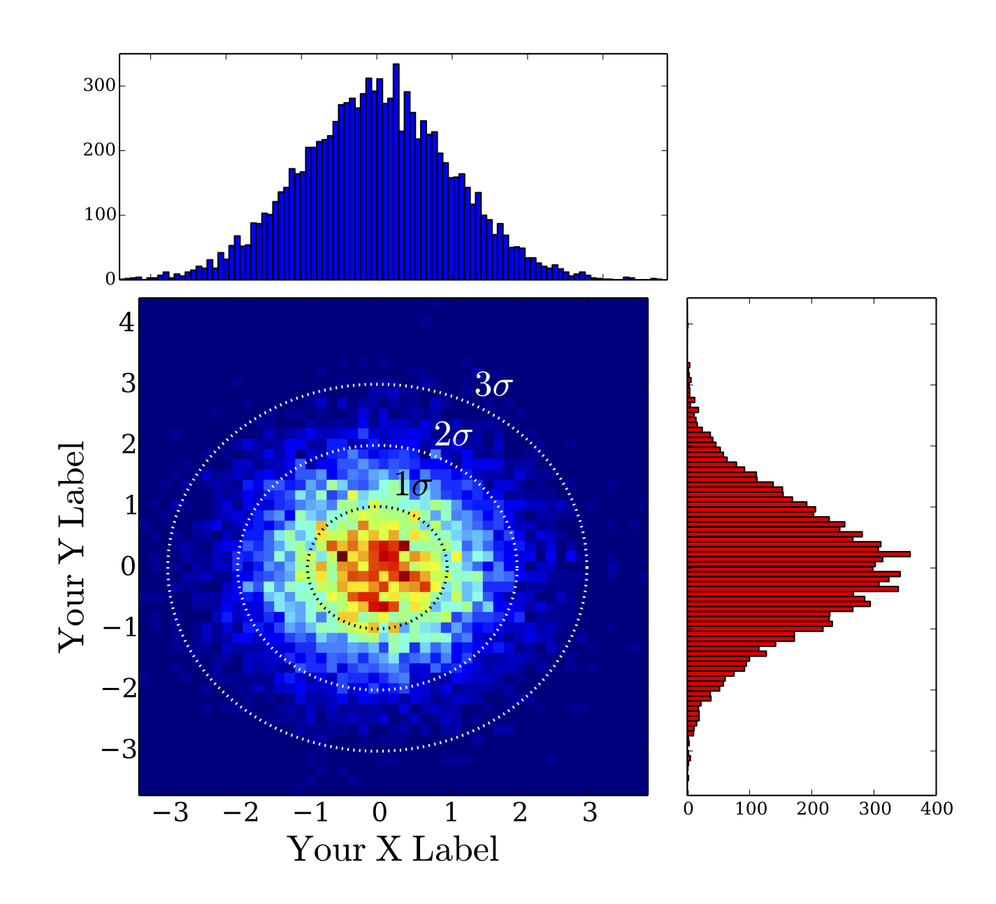
Left: Fern data read from txt file. Center: trigonometric functions (sine, cosine and tangent), gaussian function, multivariate normal distribution and finally transparent circular points. Right: bivariate distribution.
Read More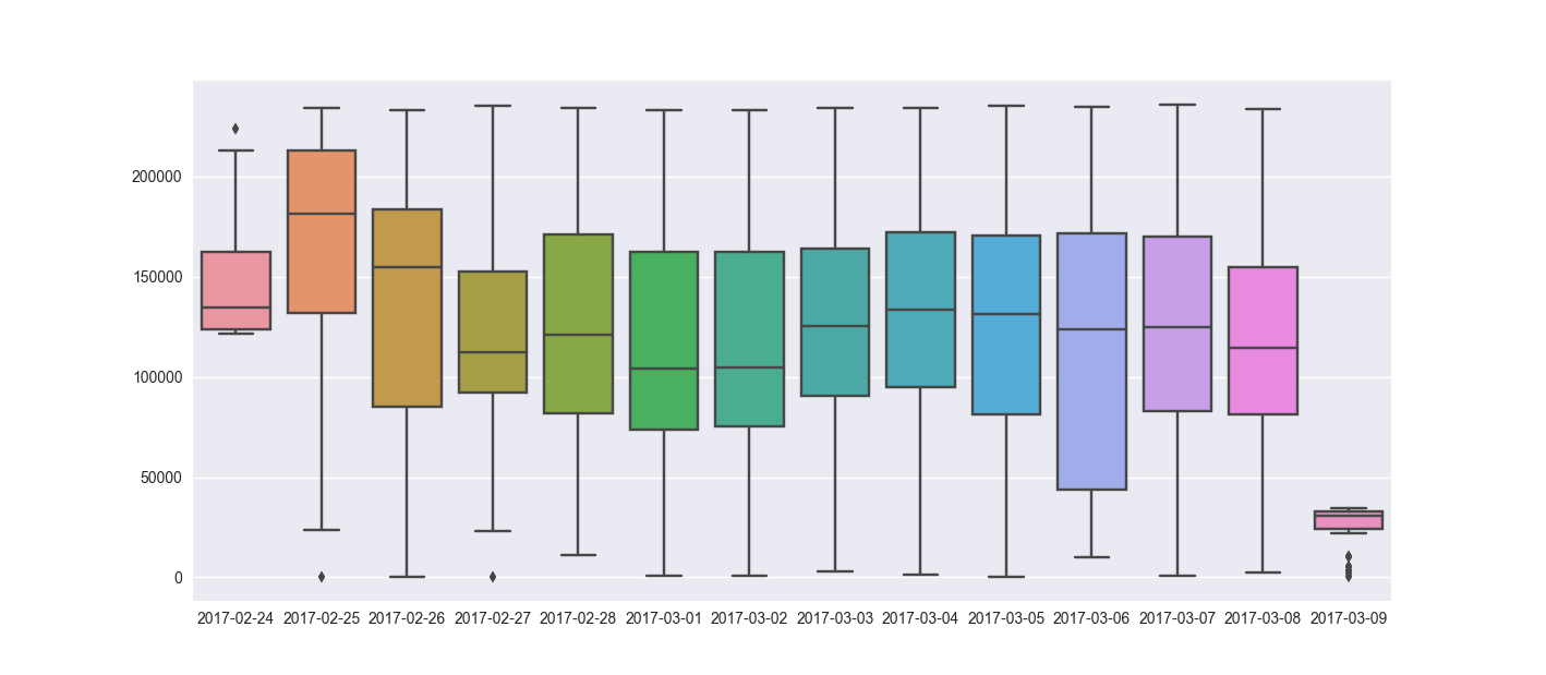
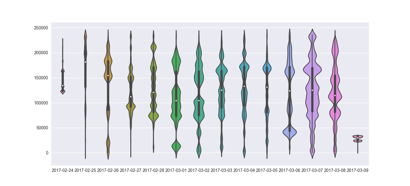
Data visualization of triggered events
Analysis of test data from the Medico company Saninudge
Left: Box plot (This kind of plot shows the three quartile values of the distribution along with extreme values. The “whiskers” extend to points that lie within 1.5 IQRs of the lower and upper quartile, and then observations that fall outside this range are displayed independently. Importantly, this means that each value in the boxplot corresponds to an actual observation in the data). Right: violinplot (combines a boxplot with the kernel density estimation procedure).
Read More